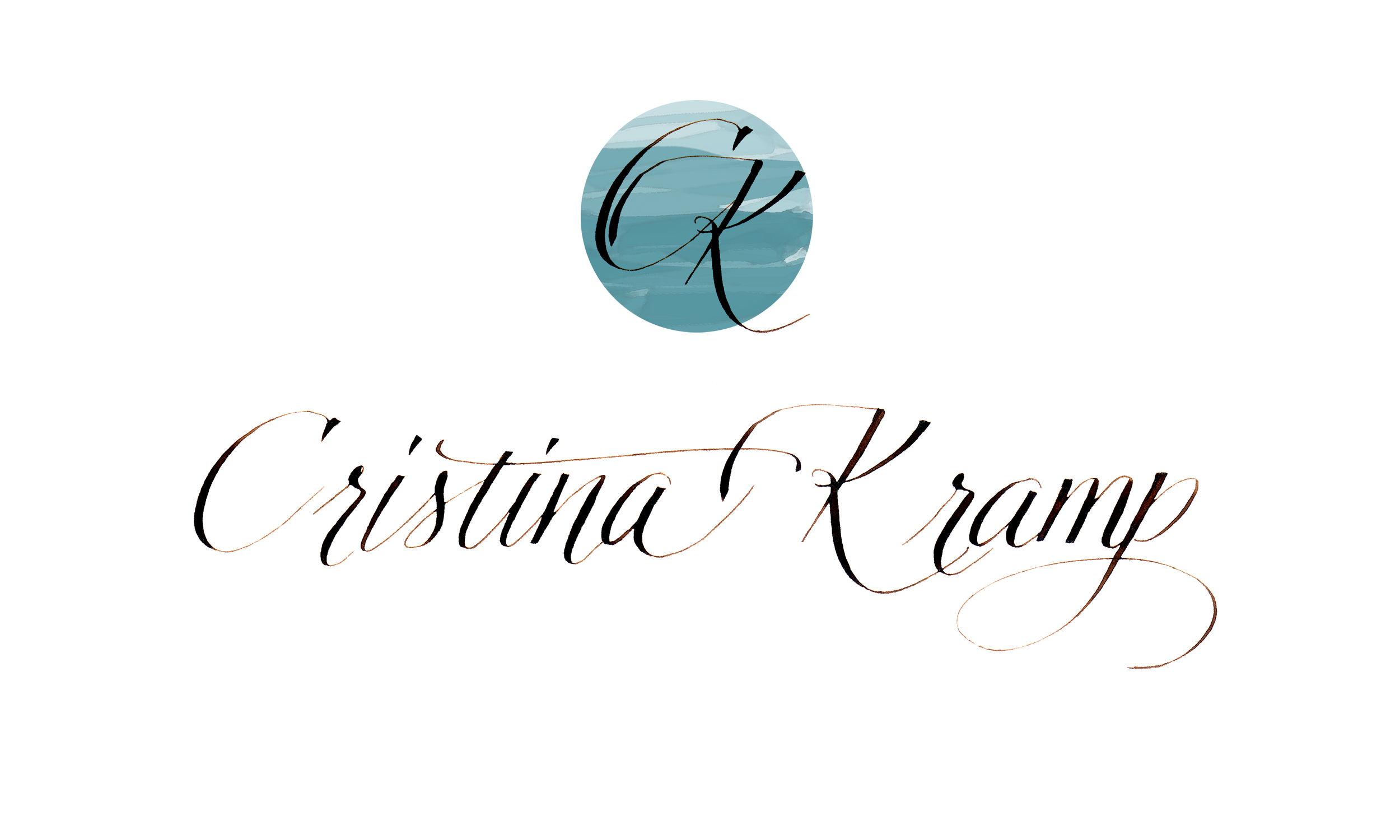
The name & logo
As I have had the chance to work on a few logos, I thought it would be fun to share what went into coming up with mine. I knew I wanted something simple, readable, symbolic. So after lots and lots of trials, the one above was the final product.
The name may look like simple handwriting, but it took several trials to get things just right. It needed to be airy, look fluid, effortless. In one of those attempts, I discover the connection of the "s" and the "t" and just had to use it.
1 of many pages of writing, many, many, many pages
I placed my initials in many different positions for the logo
As I learned about favicons, the icons that appear itty bitty on the internet. I understood, that the simple logo I was going for, needed to read well big and tiny. So, I played with a "C" and a "K". I wanted them connected as 1, on a happy squarish background, that is not totally straight. Swooping up and right, not static, and with a high contrast.
I like it, so I also use it on my pieces as a stamp, multipurpose!
This was my first official logo:
I still love the lettering of the name, but it was a bit formal and didn't fit with the vibe I was going for with my new website. Years of practice went into writing this one.
My logo is to represent my informal self, in search of the essence - the simple part of things, aiming high and right. Being 1, congruent in all aspects of my life. Seeking progression, but being realistic on my expectations, hence the unperfect square. Finding the positive (yellow) in every situation and finding what to learn from it, no experience is wasted.


