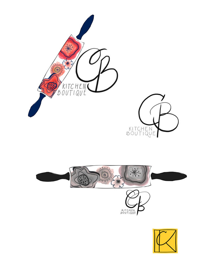
CB Kitchen Boutique logo
digitized hand lettering and drawing
I had to keep this one secret, so secret I even forgot about it. But I am excited to share about this logo and the creation of it.
It was all a beautiful process. I trully loved the research part and tweaking details to customize the needs for my friend/client. It was a back and forth dance and a learning experience for both. Choosing names and inspiration and finding what was right for her brand.
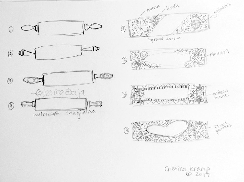
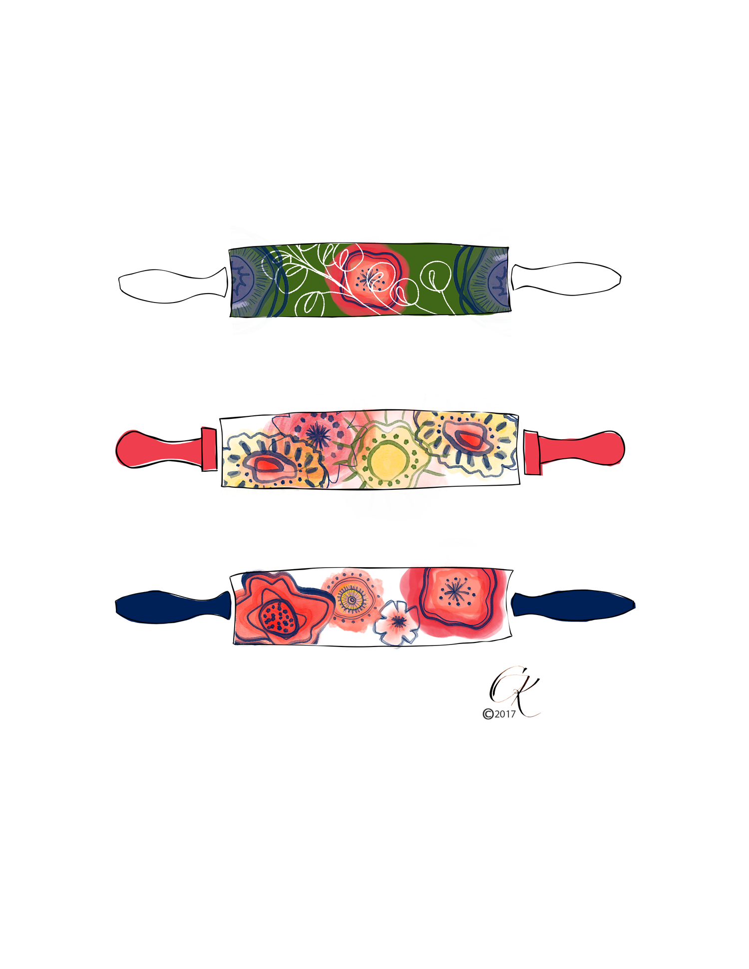
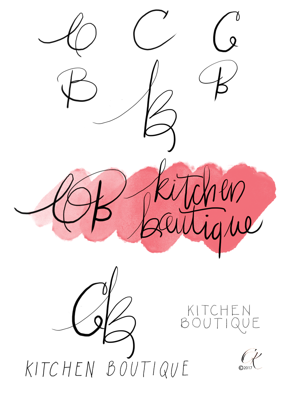
The rolling pins came first and the name followed and they were carefully placed to complement each other; with the extra play of the B being part of ‘boutique’, and the Q with a little flair since the business is based in Quito-Ecuador.
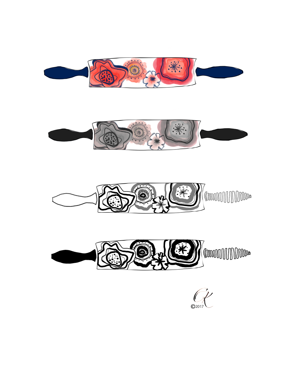
Visually it went something like this
CB are her initials and she home makes some delicious granola in Quito - Ecuador. She makes it upon request and you can reach her through her Instagram at CB Ktichen Boutique. I like that the hand-lettered aspect matches her home/hand-made product. And she is planning up more, working on a health coaching and cooking program for women.
The experience of transforming traditional hand lettering and drawings to a digital format, while keeping the organic and imperfect feel, was great! If you ever have to do that, don’t try to re-invent the wheel, there are numerous tutorials to take you there. And feel free to ask.


